Last Updated: 2022-05-02 20:58:46
Money is the lifeblood of your business, so it’s important that you have a clear understanding of where it’s coming from, where it’s going and all the stops in-between. This is usually communicated through three financial statements: the income statement, balance sheet and statement of cash flows. In the example below, we’ll show you how to take an income statement from bland to bold in Tableau.
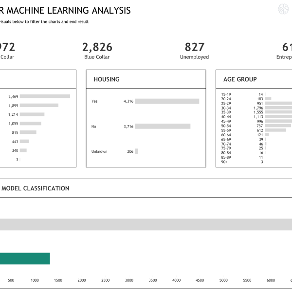
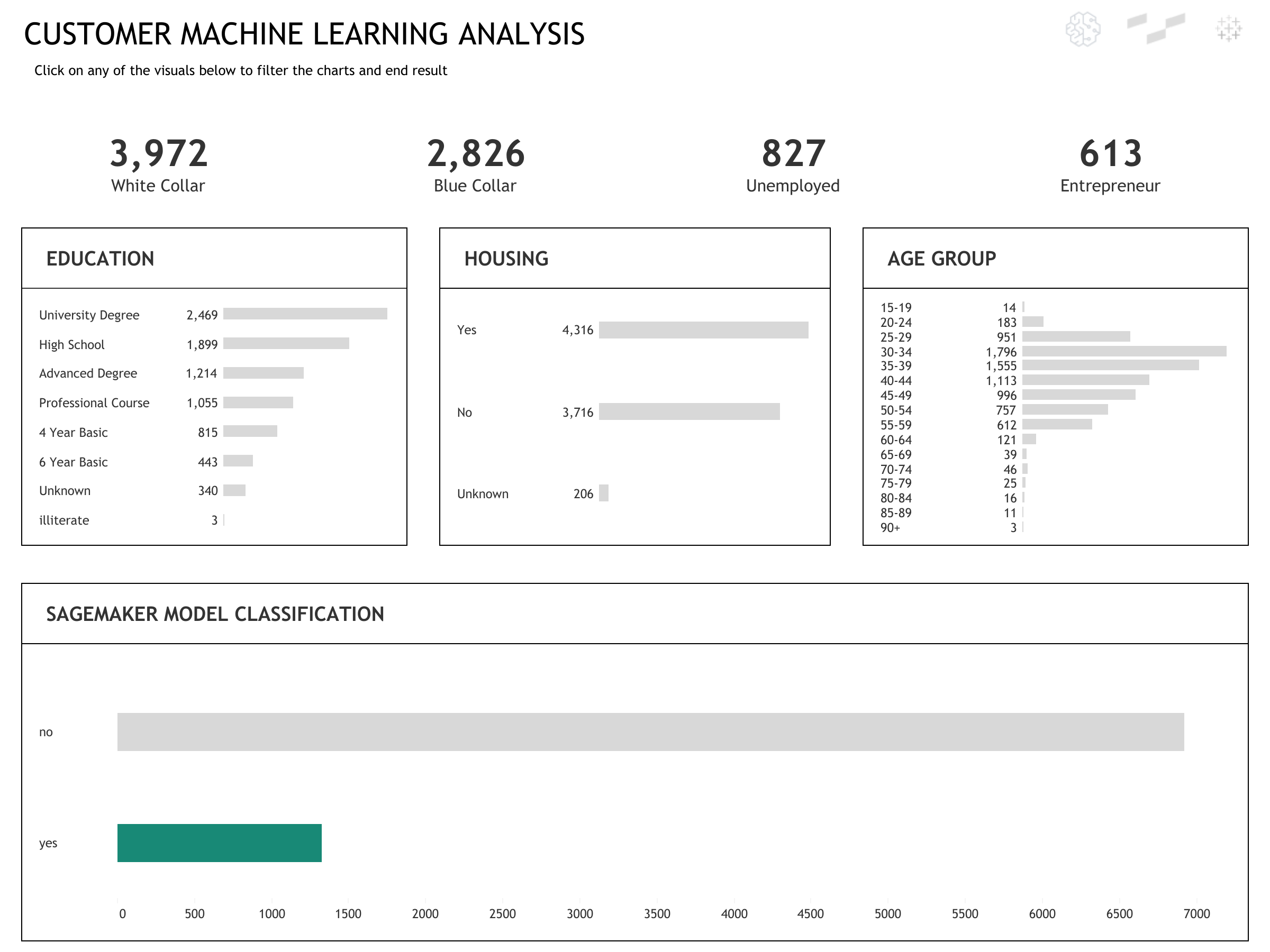
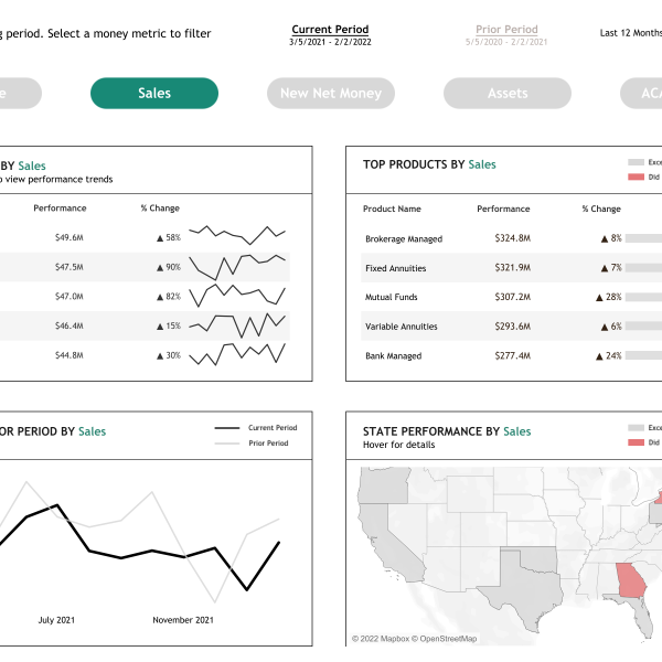
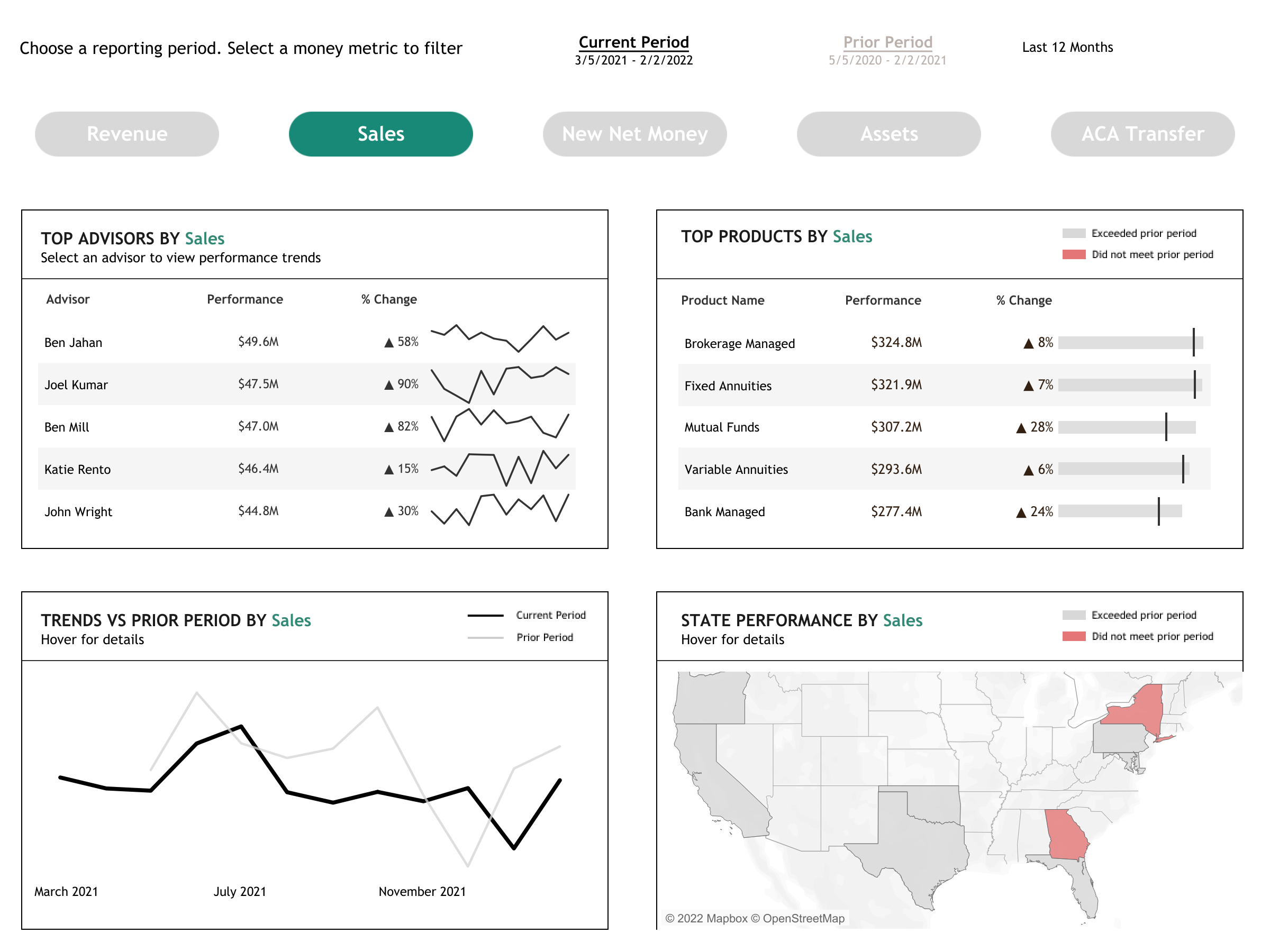
Step 1: Initial design
Income statements are normally crosstabs, but by no means do you have to stick with tradition in Tableau. On the other hand, there are many ways to enhance user experience without deviating from the standard. Try adding KPIs to draw attention to your most important metrics. Then, consider using filters and actions to help users sort through the data that’s most relevant to them, perhaps by region or time period. The primary goal of this step is to push back on tradition and present data in a new or modified way.
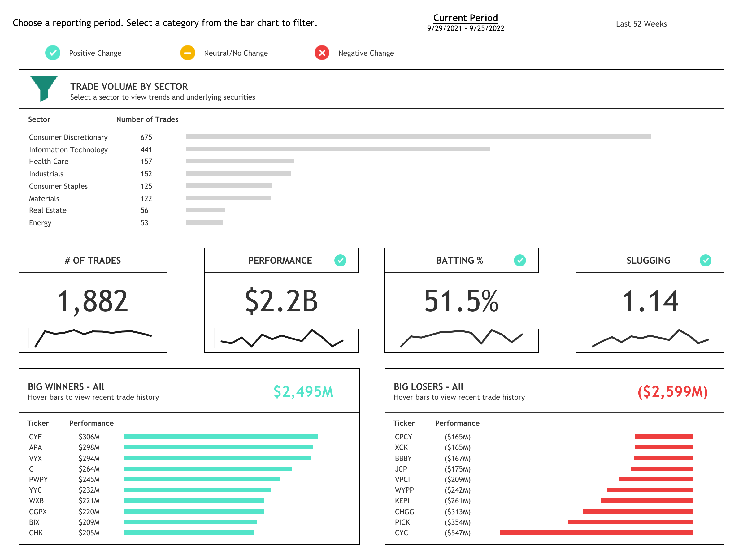
Step 2: Feedback & Iteration
After presenting your initial dashboard design to your group of stakeholders, the next step is to take their feedback and iterate. Hone down exactly what they’re looking for and consider how to connect them to those insights more efficiently. Cut unnecessary text, streamline and clarify your labels, add indicators and benchmarks where it makes sense, and incorporate color with purpose. Be patient and keep iterating until something sticks.
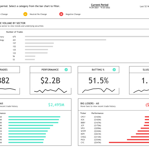
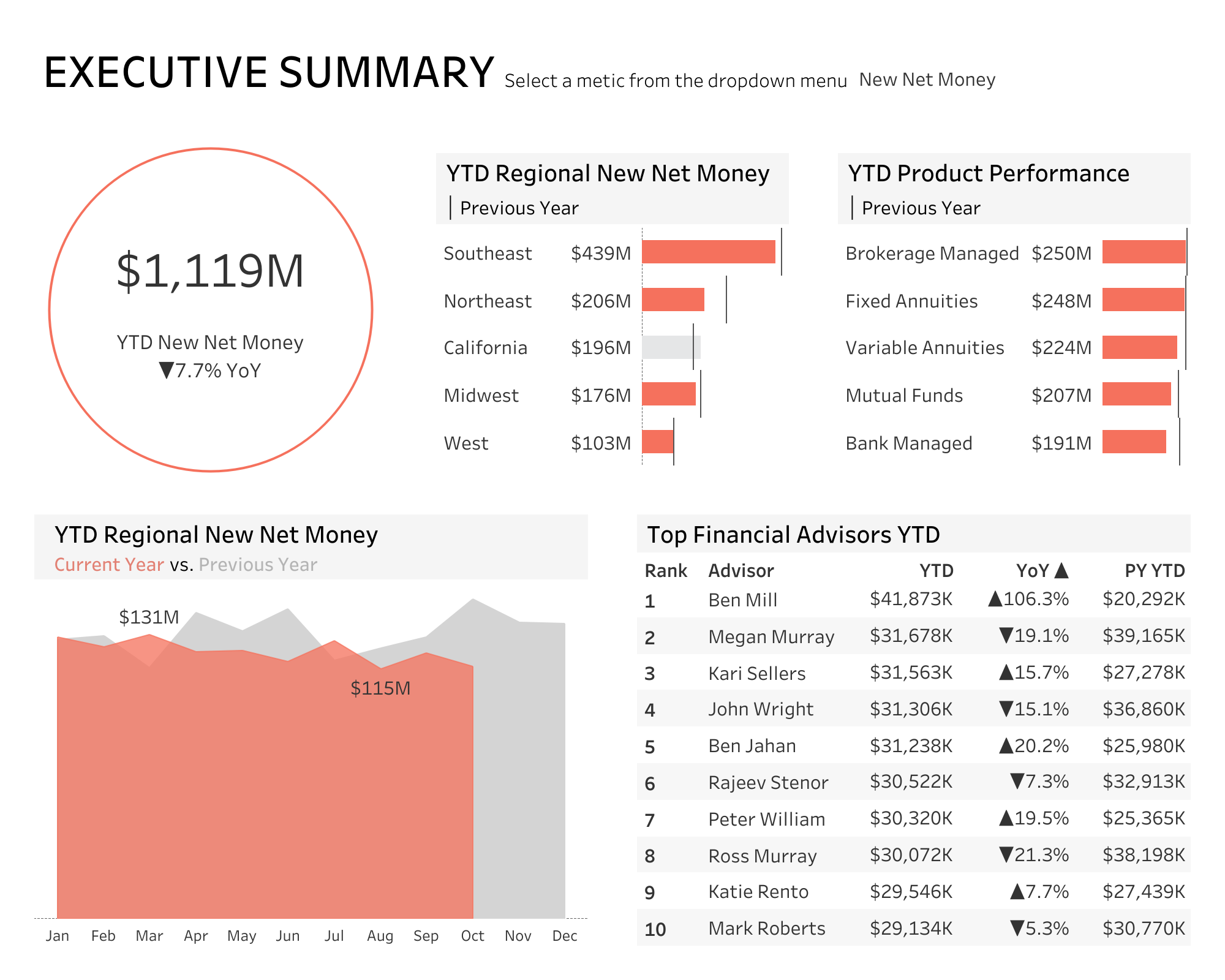
Step 3: The Final Dashboard
We know you’re excited, but before you publish your new-and-improved income statement, consider these details: Does your dashboard show the most important information as quickly as possible? Do you sacrifice any granularity, or do you provide a way to drill down into the data? Does your design feel busy, or has it been streamline as much as possible? Is your use of color helpful or distracting? Small refinements can go a long way in increasing your dashboard’s overall impact.